How to choose a kitchen backsplash - let's use 3D renders
Have you ever looked at one or a few tiles in your hand and had the difficult decision of choosing a backsplash from just these few pieces? Then you are not alone - choosing a full design from a small sample is never easy! In this blog I discuss how we used 3D rendering to help us choose backsplash tile in this kitchen.
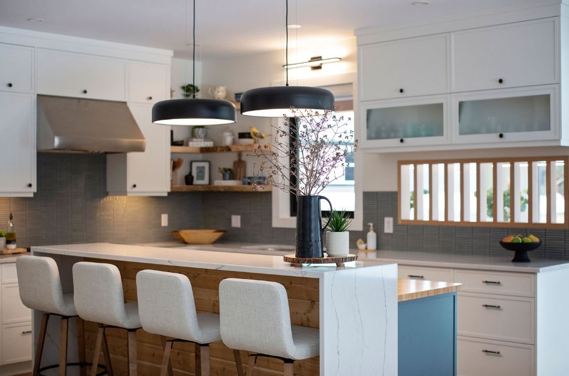
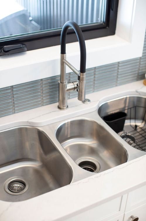
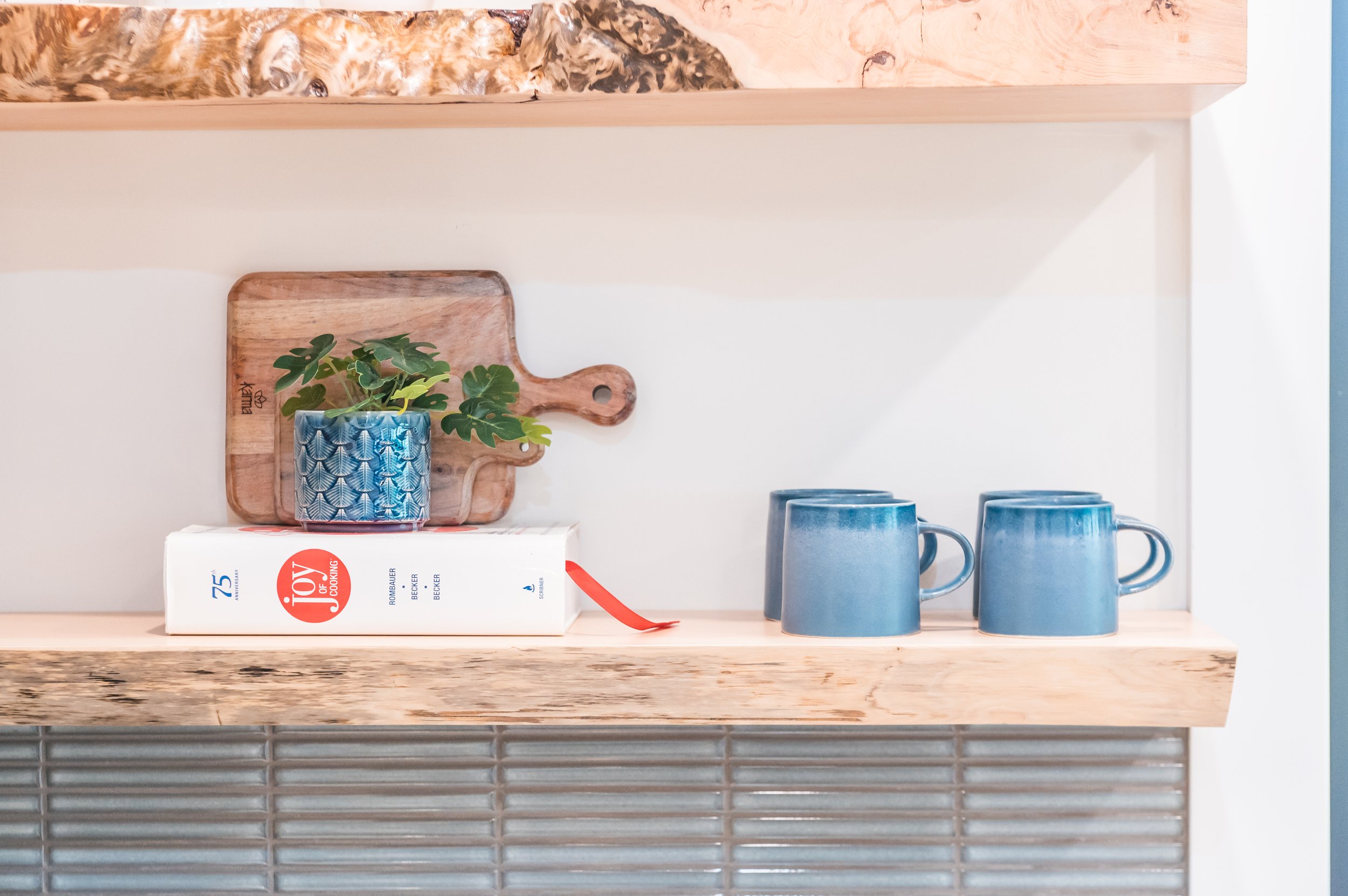
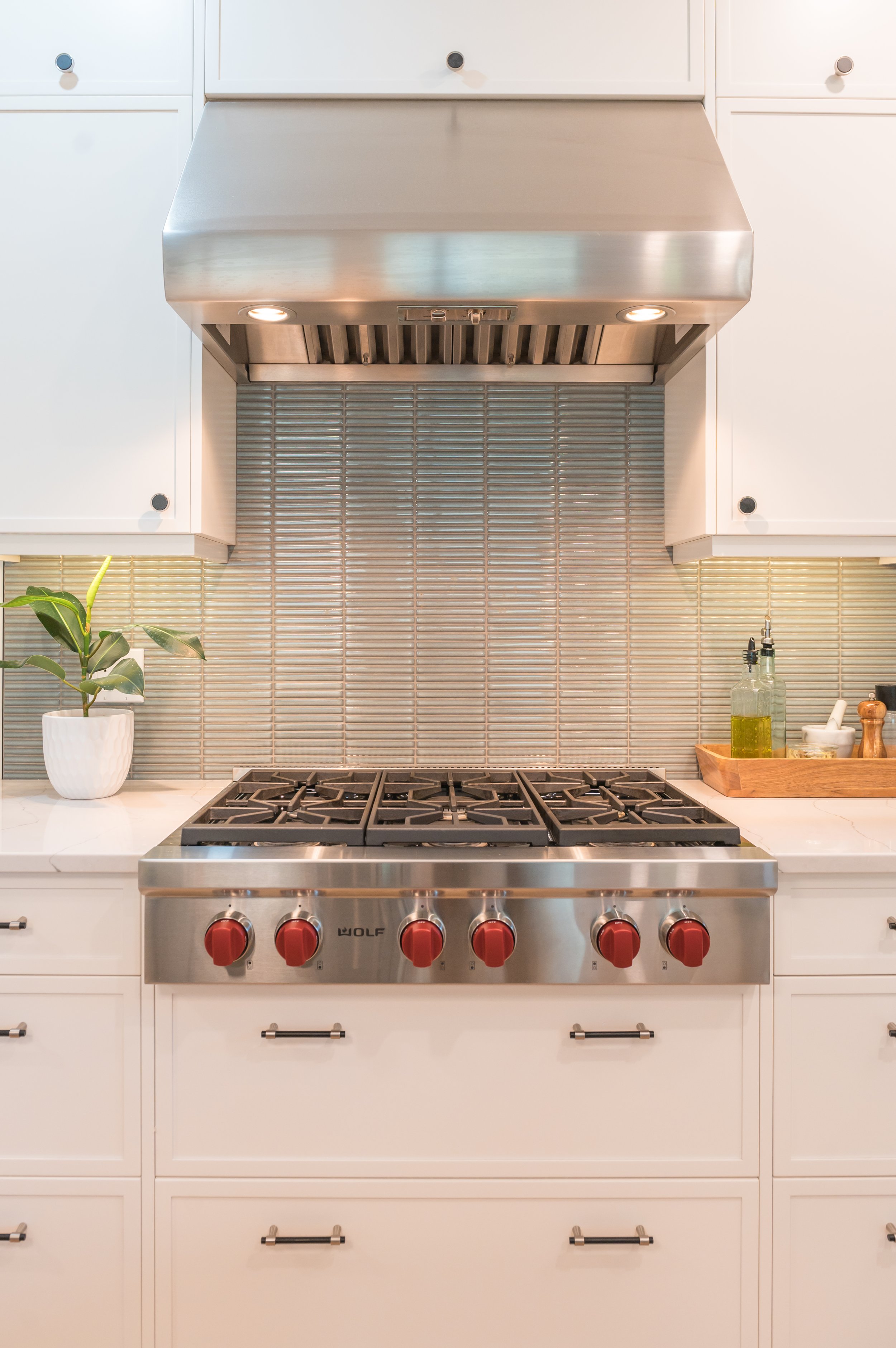
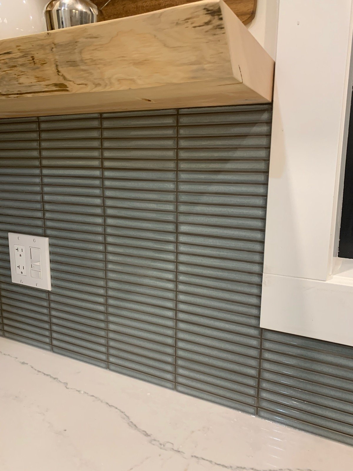
This is the completed kitchen with the Kit Kat tile from Julian Tile - installed horisontally and only below the shelves, although we extended the tiles above the range for practical reasons.
I love design and technology and that is why I love 3D rendering ! I love how I can combine my ideas with technology to enhance my designs and at the same time help clients with difficult or costly decisions. I recently worked on a new construction in Nelson, BC and we used 3D rendering extensively to help our design process and decision making.
How to choose the perfect kitchen backsplash
Choosing the right tile for your kitchen is an important decision and you have to be happy to live with your choice for many years to come. Sometimes the backsplash tile can be the inspiration for the whole kitchen design, but generally the backsplash is chosen after the cabinet style, cabinet colour and counter tops have been chosen.
What is 3D rendering?
3D rendering is a crucial tool that allows designers to create realistic visualizations of spaces before they are actually built or renovated. The design is created completely digitally allowing designers and clients to see the design concept virtually. With modern software designers are now able to create images that closely resemble the intended final result like the exact colour, texture and patterns of different design elements. This gives clients a clear understanding of how the designed space will look look before the financial commitment. It also help designers to tweak and refine the design until the design is perfect.
Why is 3D rendering helpful in kitchen design?
3D renderings allow the client to ‘see’ the design in advance to help visualise the space.
Backsplash tile often dictates the entire kitchen design direction, so the colour, shape and material is so important
Often other decisions are based on the backsplash - perhaps the colour and style of the cabinets and the island colour
Tile placement: Quite often the question comes up about where and how high up the wall the backsplash tiles should go? Should it just be halfway up the wall or all the way up to the ceiling?
Size and scale also comes into play - which tile size will work best for a neat and tidy layout and create the desired feel and look of the kitchen?
Shape of the tiles is also a big consideration - it needs to work with the larger patterns in the room such as the flooring too
Tile direction: Some tiles can be installed vertically or horizontally and can create very different outcomes
Backsplash tiles come in array of colours and patterns - should you choose plain tiles or inject some visual interest with a pattern
Other fixtures: A designer will also plan tile placement to work around windows, appliances and electrical outlets
Our favourite tiles - which one to choose?
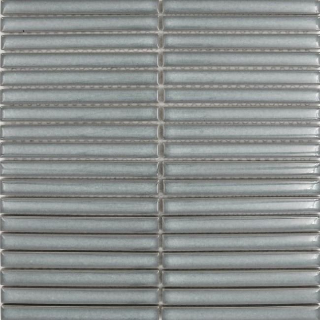
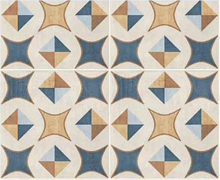
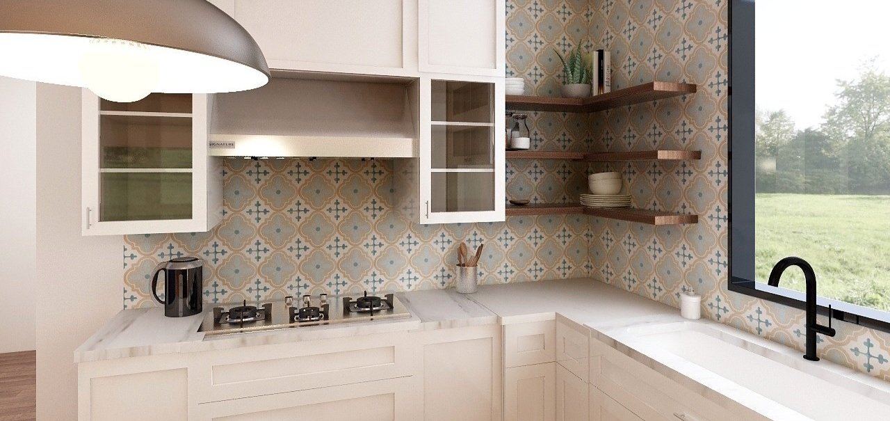
Considerable time was spent sourcing the perfect tile for this kitchen - online, in person and as far as Calgary and Vancouver and we finally narrowed it down to a few of our favourites! We loved all these as they introduced colour, pattern and visual interest. The colour was very important - we wanted a blue-green tile which would provide the colour in the otherwise all white kitchen and we wanted it also to work with our light oak flooring. Our favourites were from left to right, Saltillo Urban 8’x8’, Julian Kit Kat 12’x12’, Ceramstone Decor 10’x10’ and Centura Patchwork 8’x8’
Decision making time!
Choosing between plain tiles and tiles with a pattern for your backsplash depends on your personal style, the overall design aesthetic of your kitchen, and the visual impact you want to achieve. Both plain and patterned tiles have their advantages, and the decision often comes down to the specific look and feel you desire.
Patterned tiles
Visual Interest: Patterned tiles can add a layer of visual interest and personality to your kitchen. They become a focal point and can contribute to a more vibrant and dynamic overall design.
Style Statement: If you want your back splash to make a bold style statement, patterned tiles offer an opportunity to infuse unique and eye-catching elements into your kitchen.
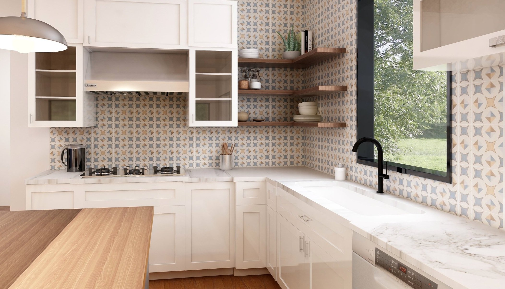
In this image below you will see the Saltillo Urban 8’x8’ on the left and the Ceramstone Decor 10’x10’ on the right.
Plain tiles
Timeless Elegance: Plain tiles, especially in neutral colors, tend to have a timeless and classic appeal. They can create a clean and understated look that complements various kitchen styles.
Versatility: Plain tiles are versatile and can easily blend with different design elements in your kitchen, including countertop materials, cabinets, and flooring. This versatility allows for more flexibility in updating other design elements in the future.
Easy to Coordinate: If you prefer to experiment with bold colors or patterns in other aspects of your kitchen, plain tiles provide a neutral backdrop, making it easier to coordinate with other elements without overwhelming the space.
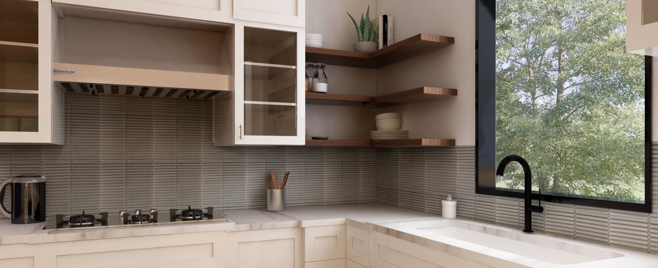
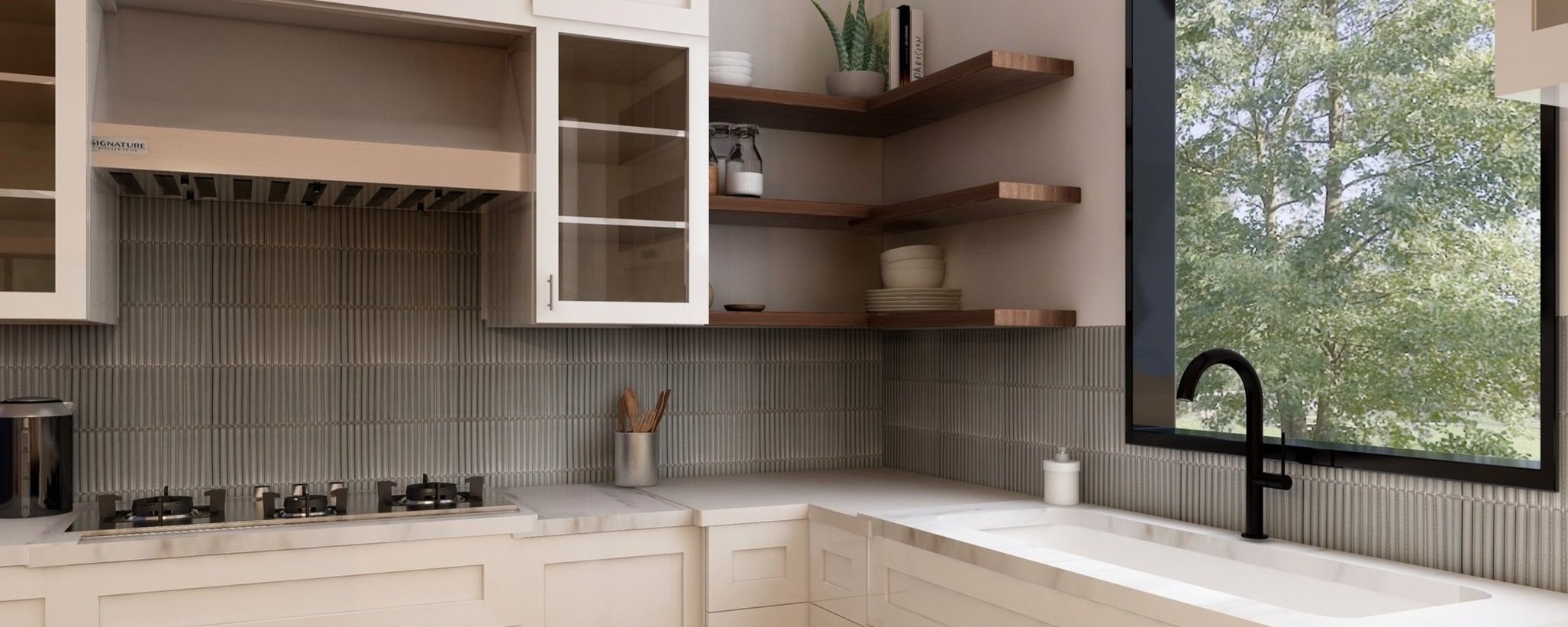
In this image below you will see the Julian Kit Kat tile (12’x12’). In the left render, the tiles are horisontally and in the right hand render, the tiles are placed vertically.
And the winner is…
Our 3D renders made it so easy to choose the backsplash for this kitchen - in the end we decided on the Kit Kat tile from Julian tile in a horisontal position. This worked well with all the other elements in the kitchen. It was clearly the winner!
Planning your tile placement around other fixtures
Designers usually use elevation drawings to plan tile layout, but this can easily be done with 3D renders too as the tile dimensions are exact and we can even take into account the grouting thickness. Seeing that backsplash tiles are on vertical surfaces (the walls) it is important to make sure that the tile placement work with other elements which are on the wall such as windows, range hoods, shelving and electrical outlets.
So which areas are important for planning your tile placement:
Windows: Quite often kitchen windows are placed near the sink, so this area is important. The final outcome depends on how well you plan around these 2 areas.
Range hood: Another important place to consider is the area behind the range hood, not only does the back plash acts as protection, but it is often quite a large area and therefore important to center your design around this focal point
Electrical outlets are another important place to consider - several outlets might be along your counter top and you might even have one or two light switches which needs to be taken into account to. This decisions needs be made fairly early on in renovation or new construction as the electrician will be doing the wiring at the framing stage
Shelves - quite often kitchens have open shelving and the height and extent of these also needs to be taken into account
See some examples below of how advanced planning can create dream backsplash outcomes
Local Design Partners:
This was a fun project bringing together some local Kootenay businesses!
Kitchen design: The Kitchen Connection
Interior design: 3D rendering, Colour, countertop, backsplash, hardware, lighting, furniture, styling by Bibby Fine Interiors
Custom life edge shelves: Thierry Brionne Furniture and Spaces
Lighting: Mountain High Lighting
Photography: Lisa Seyfried Photography and Dustin Lalik
